Branding, RSI
BRIEF
Well-being is a right that belongs to all of us, regardless of our status, situation, gender or age.
The Valencian Public System of Social Services guarantees this right through a set of services, centres and programmes that promote the autonomy and dignified life of people by providing them with information, care and support through a close network that protects diversity, social integration and equal opportunities in each of our three provinces.
The challenge was to develop a new image for the service, faithfully representing the main values on which it is based.
IDEA
To take the circle as an initial element, as a symbol of inclusion and collaboration. Multiply it by three to transmit through a friendly way different values and characteristic elements of the Valencian Public System of Social Services: (Information / Care / Support, but also Resources / Benefits / Services or Heart / Life / Network, as well as symbolizing the union and the existing relations between the three provinces of the Comunitat Valenciana.
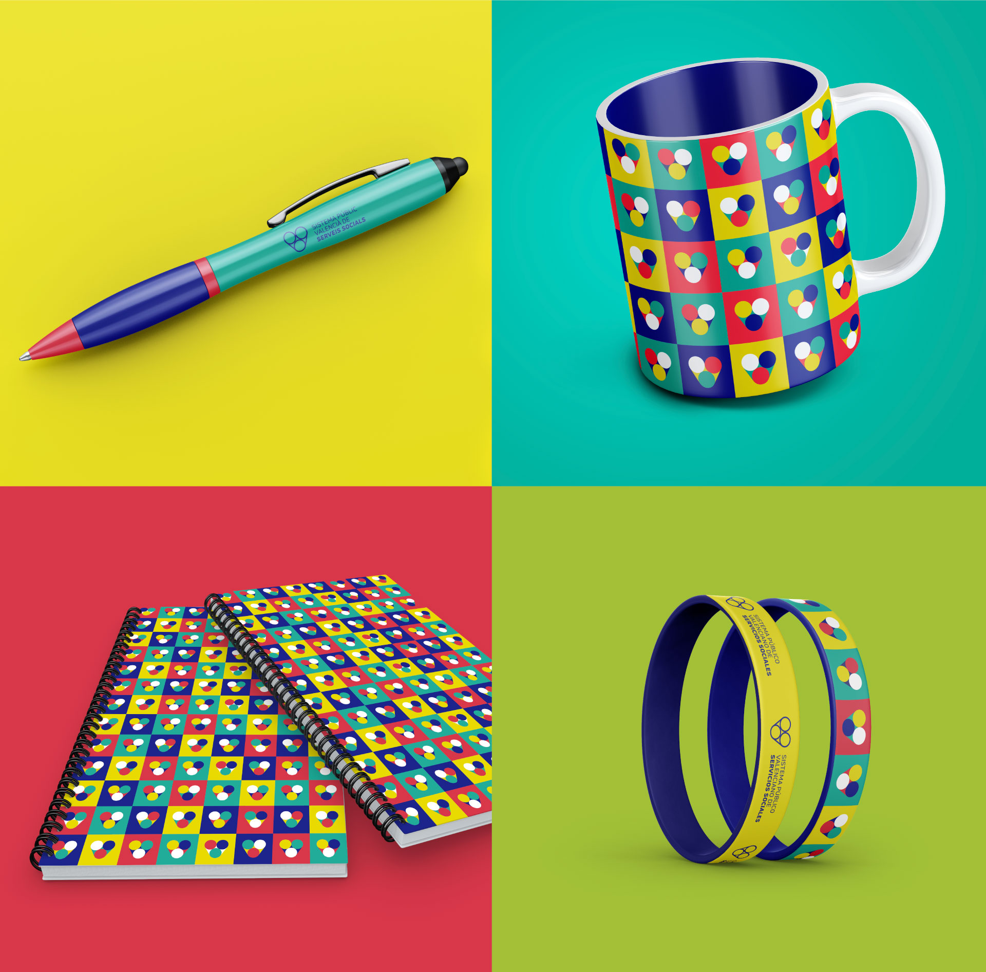
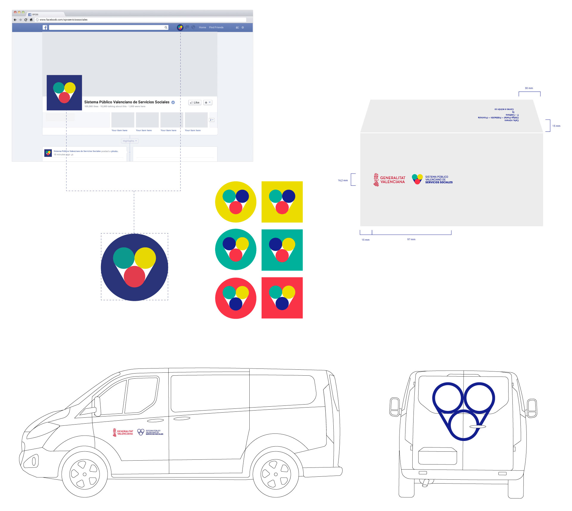
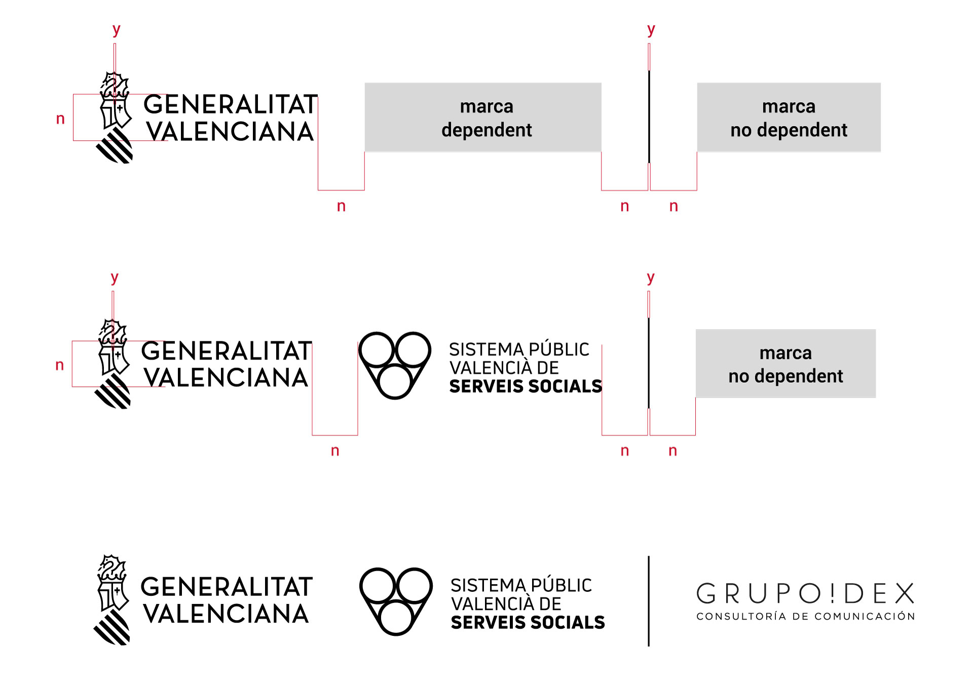
The result is a logo and an associated graphic system that is lively, dynamic and versatile, which can be visually integrated in different contexts and linked to social services and the Valencian Community, in accordance with both the identity of the Generalitat Valenciana and external brands.
A warm and close identity that, in addition to facilitating the transmission of those values that are in the DNA of the Valencian Public System of Social Services, facilitates the hierarchy of the different types of existing centres.
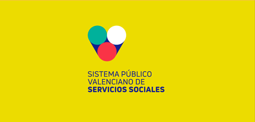
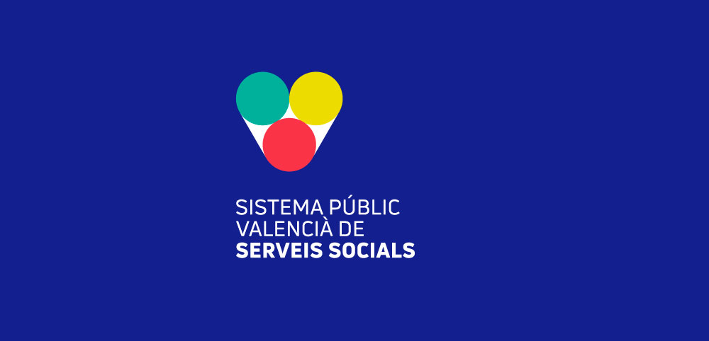
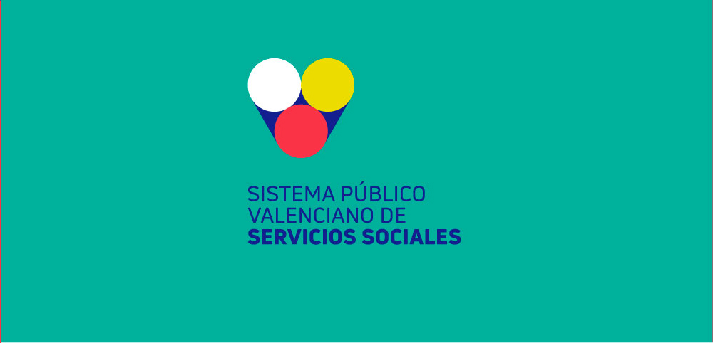
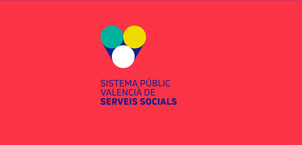
Partimos del círculo, objeto básico en geometría. El logo propuesto se articula en torno a una estructura triangular delimitada por tres círculos.
Cada uno de ellos viene a simbolizar elementos y valores (propios del Sistema Público Valenciano de Servicios Sociales) que solo alcanzan su verdadero valor cuando interactúan entre sí.
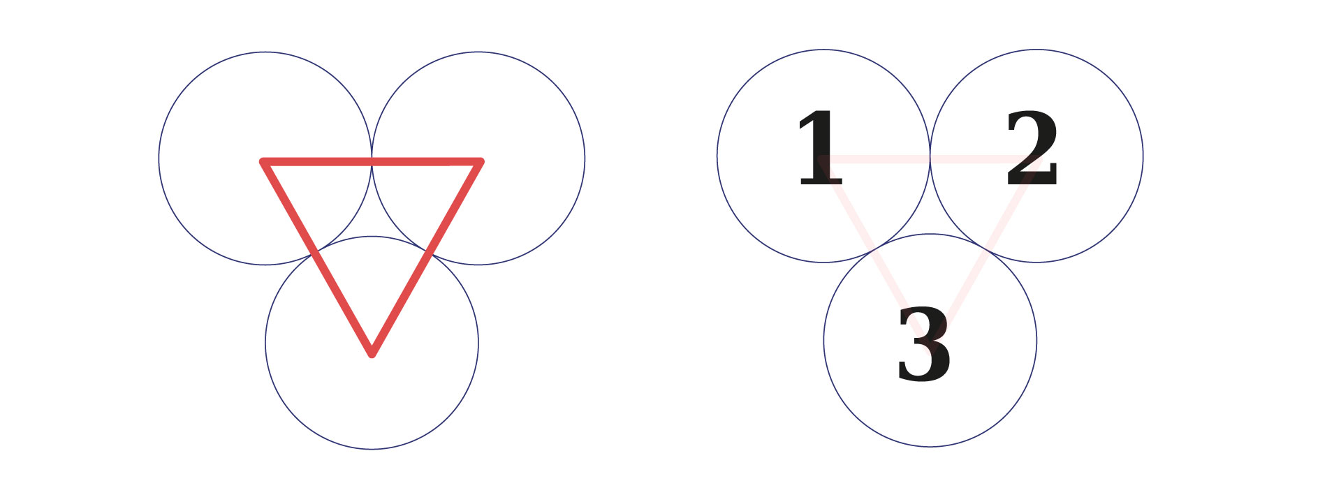
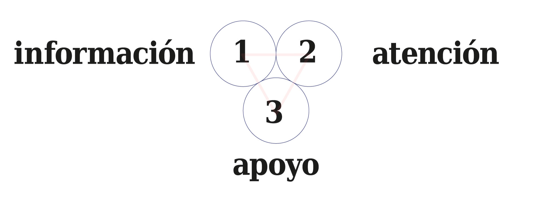
Así, los círculos pueden constituir una representación simplificada de aquellas áreas de actuación trabajadas en el Sistema Público Valenciano de Servicios Sociales (Información, Atención, Apoyo).
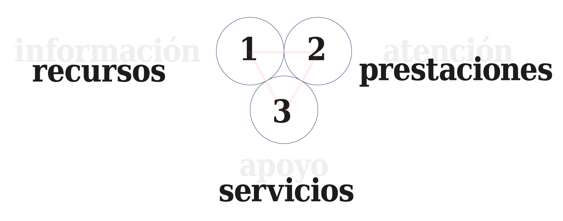
Pero también de aquellos elementos fundamentales que caracterizan al sistema (recursos, prestaciones y servicios).
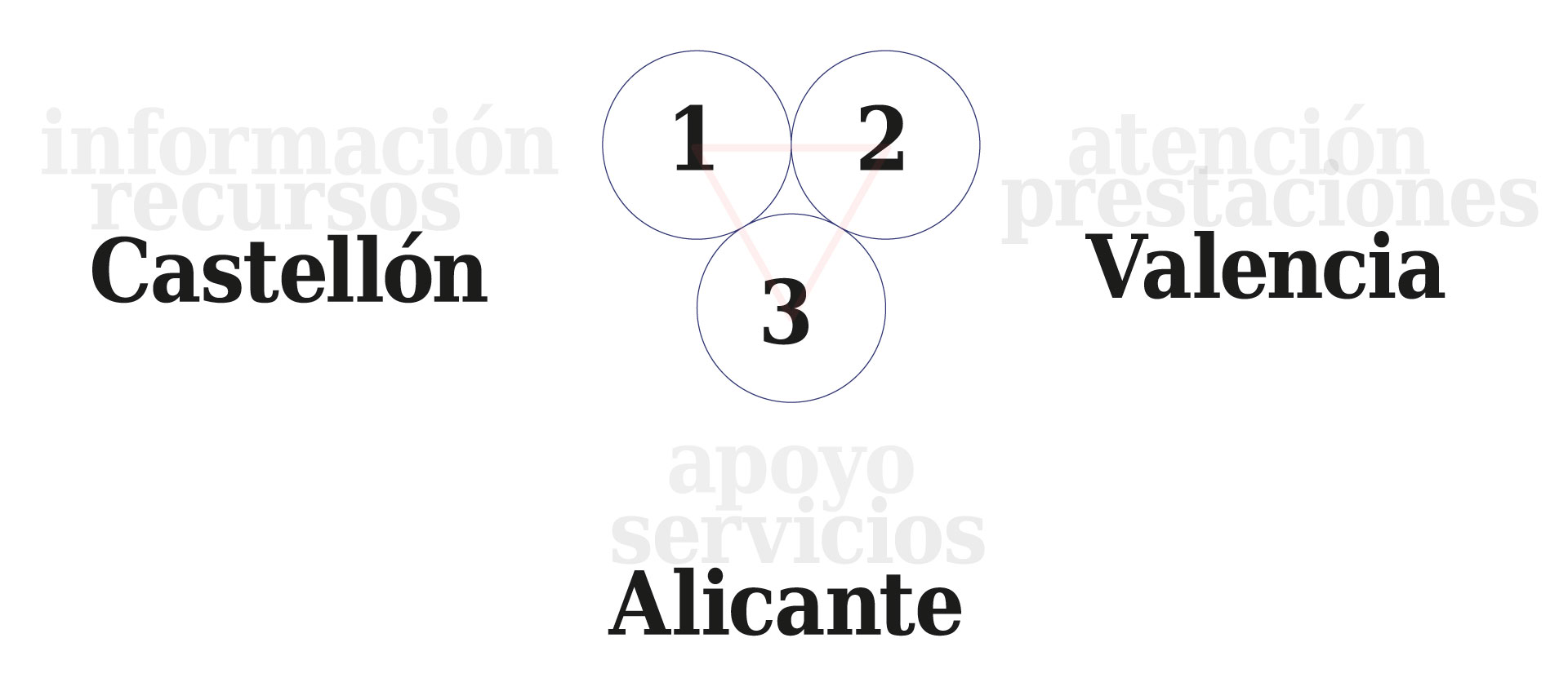
Sin olvidar el hecho de que cada uno de los círculos puede representar a cada una de las tres provincias de la Comunitat Valenciana.
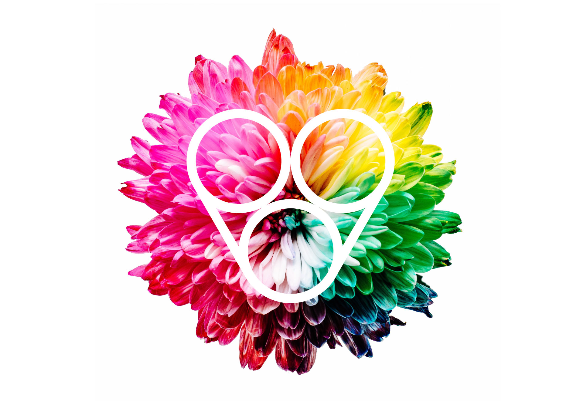
Por un lado, el perfil de un corazón, como representación del alma del Sistema. Por otro lado, la “V”, de “Valenciano” y de “Vida”. Y, finalmente, la unión de los tres círculos como símbolo de red y unión.

CORAZÓN

LETRA V (VIDA)
VALENCIA
RED
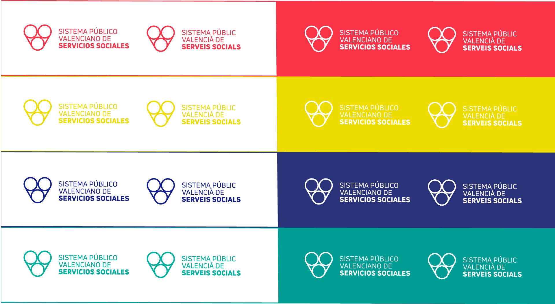
PANTONE:3965c (para impresión)
CMYK: 12 / 4 / 100 / 0 (para impresión)
RGB: 237 / 219 / 0 (para web)
PANTONE:1787C (para impresión)
CMYK: 0/ 87/ 61 / 0 (para impresión)
RGB: 249 / 53 / 73 (para web)
PANTONE:3275C (para impresión)
CMYK: 96 / 0 / 51 / 0 (para impresión)
RGB: 0 / 175 / 154 (para web)
PANTONE:2746C (para impresión)
CMYK: 0 / 87 / 61 / 0 (para impresión)
RGB: 249 / 53 / 73 (para web)
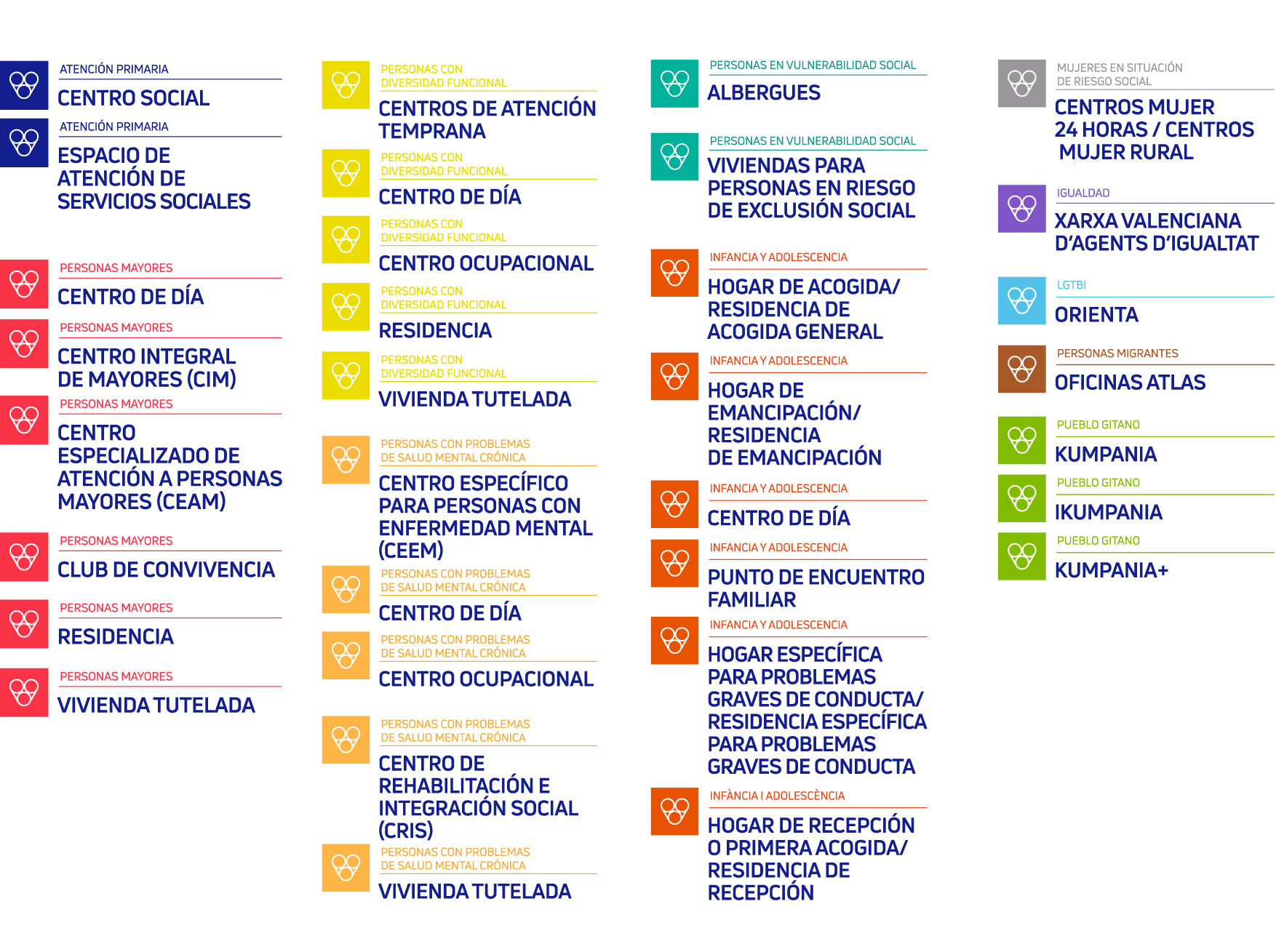
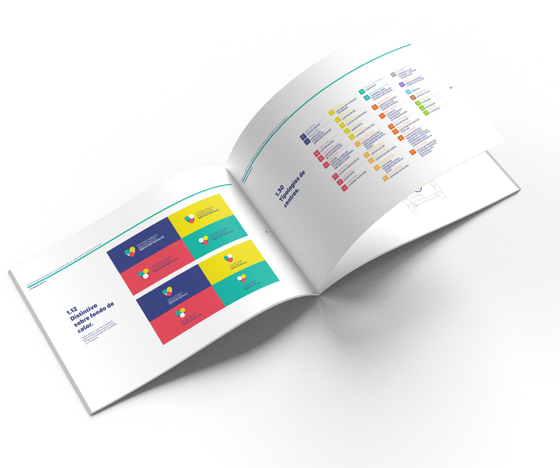
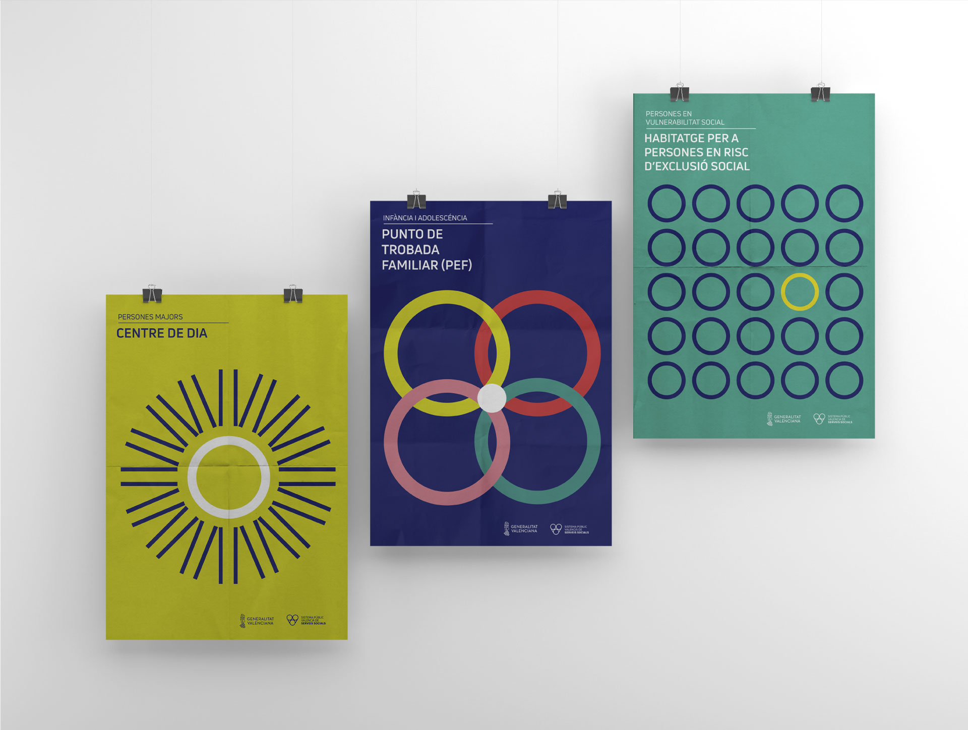
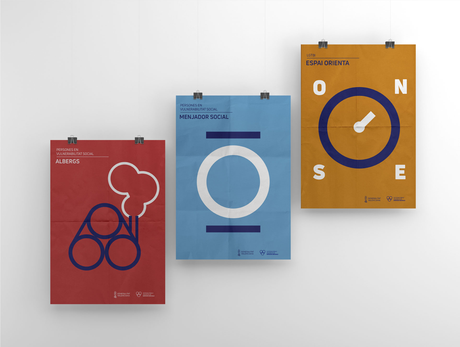
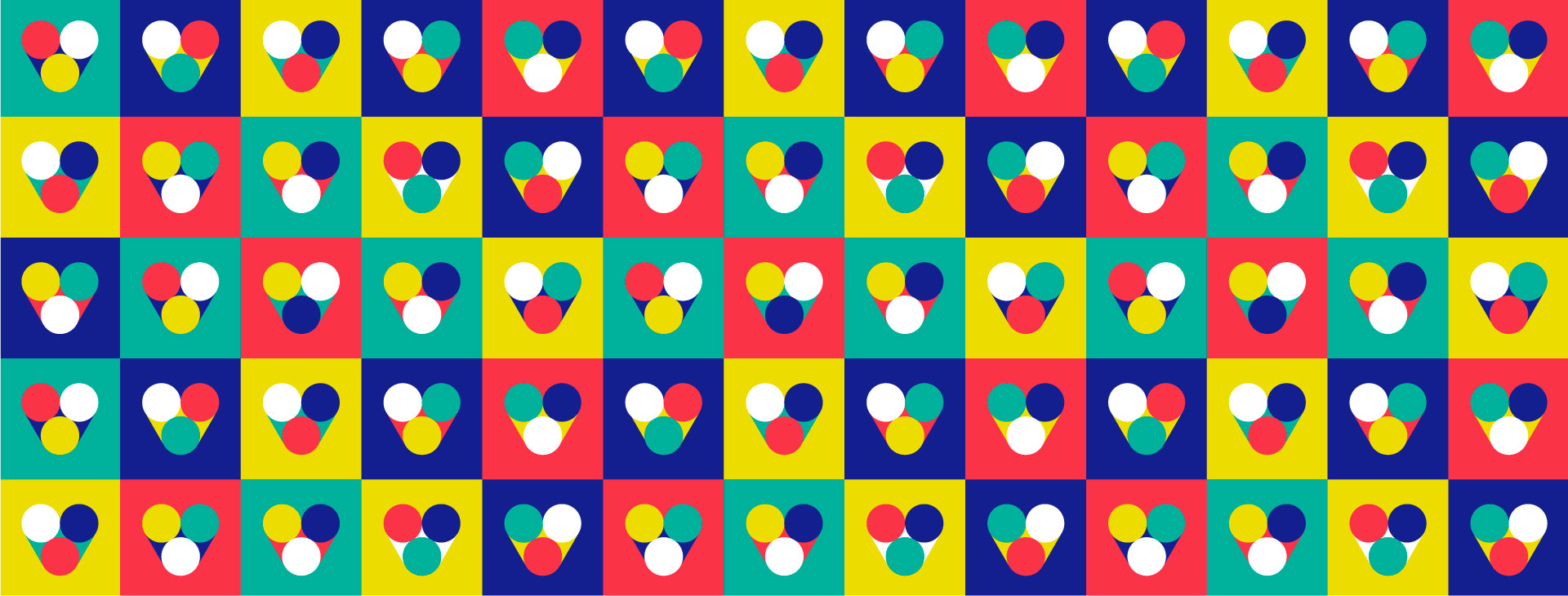
Listado de tipologías de centros. 11 en total.
Tanto el color como el texto nos identifican las 11 tipologías de centros.
El símbolo siempre está presente para identificar que pertenece al Sistema Público Valenciano de Servicios Sociales.
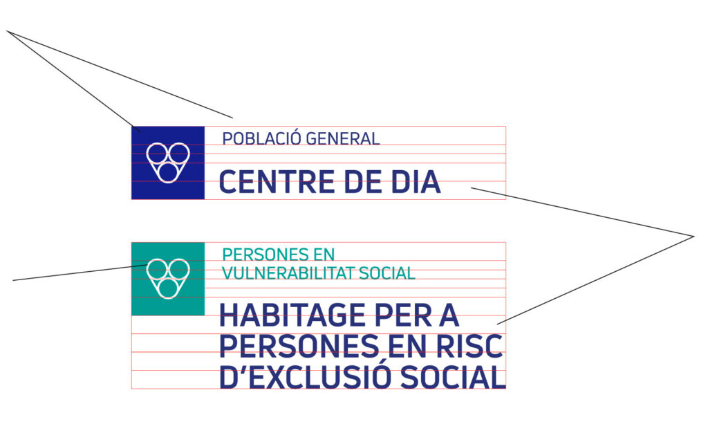

A continuación siempre se describe los diferentes servicios que ofrece cada tipología de centro.