Press and Media, RSI, Strategy
BRIEF
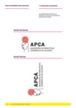
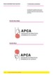
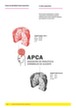
Elisa Torres, manager of the Cerebral Palsy Association of Alicante (APCA) came to Grupoidex with two clear ideas: “We urgently need people to know and recognize us”. And “You can do whatever you want, but the logo is not touched! It has been with us all our lives and we are very fond of it”.
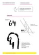
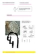
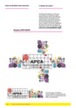
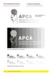
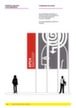
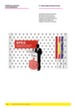
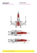
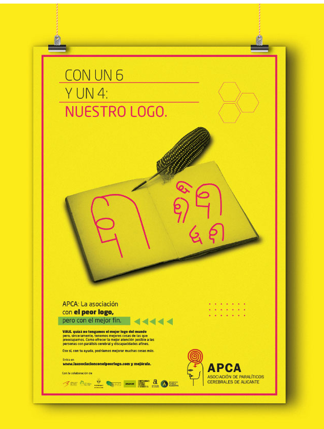
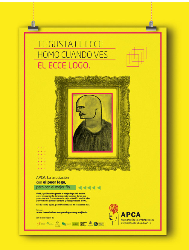
And of course, when you see that the logo of a non-profit association -whose main objective is to improve people’s quality of life- is the face of a bald man with a cyclops look and a spiral shape on his head, well, your eyes pop out.
IDEA
But after giving it some thought and careful consideration, we realized that something that is inconceivable for us, for an Association whose only concern is the people – and with the few resources you have, you want to take care of them – This can easily be put on the back burner.
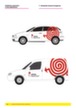
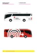
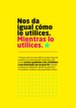
From weakness we decided to make a virtue and make APCA the only Association that publicly admits the ‘shortcomings’ of its corporate identity because its true identity lies in people.
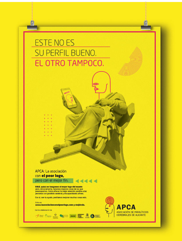
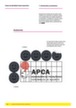
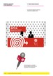
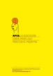
UTILIZAR
EL PEOR LOGO
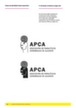
MEJORA NUESTRA
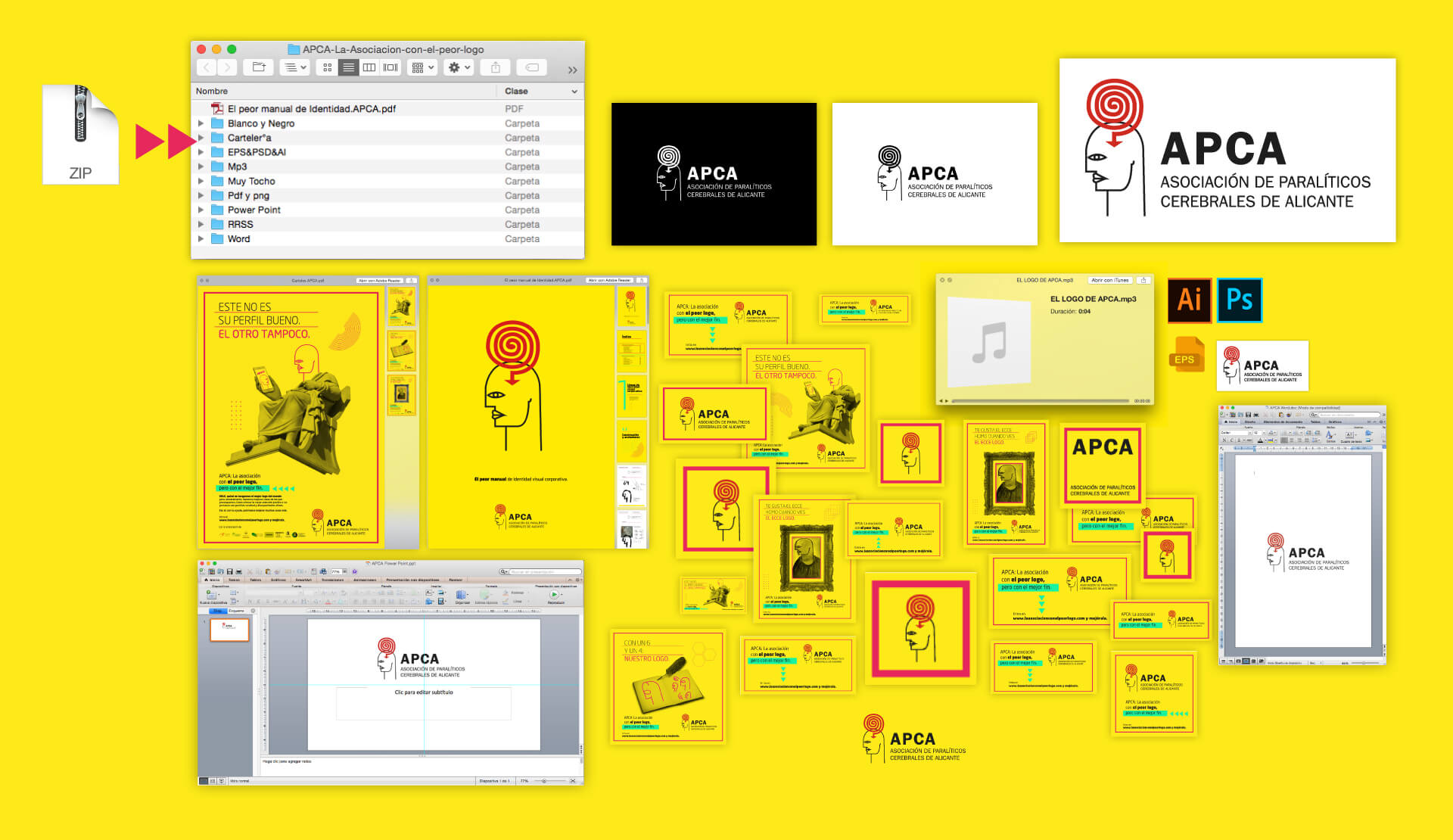
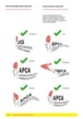
ASOCIACIÓNLos usuarios se pueden descargar el logo de APCA en todos los formatos posibles: JPG, PNG, PSD, AI, MP3, DOC, PTT, etc…
Hasta los que nos hemos inventado.