Branding, RSI
BRIEF
The Sandra Ibarra Foundation approached us with the possibility of collaborating with the pharmaceutical company Janssen in the launch of an initiative that would help to raise awareness of a very specific type of cancer: prostate cancer.
Because, although it is a type of cancer with a survival rate of almost 100% if diagnosed in time, the unwillingness of men to integrate regular visits to the urologist into their routine makes it difficult to obtain results.
We were looking for an initiative that would increase awareness of this type of cancer and that people could join, making it grow in presence and relevance.
IDEA
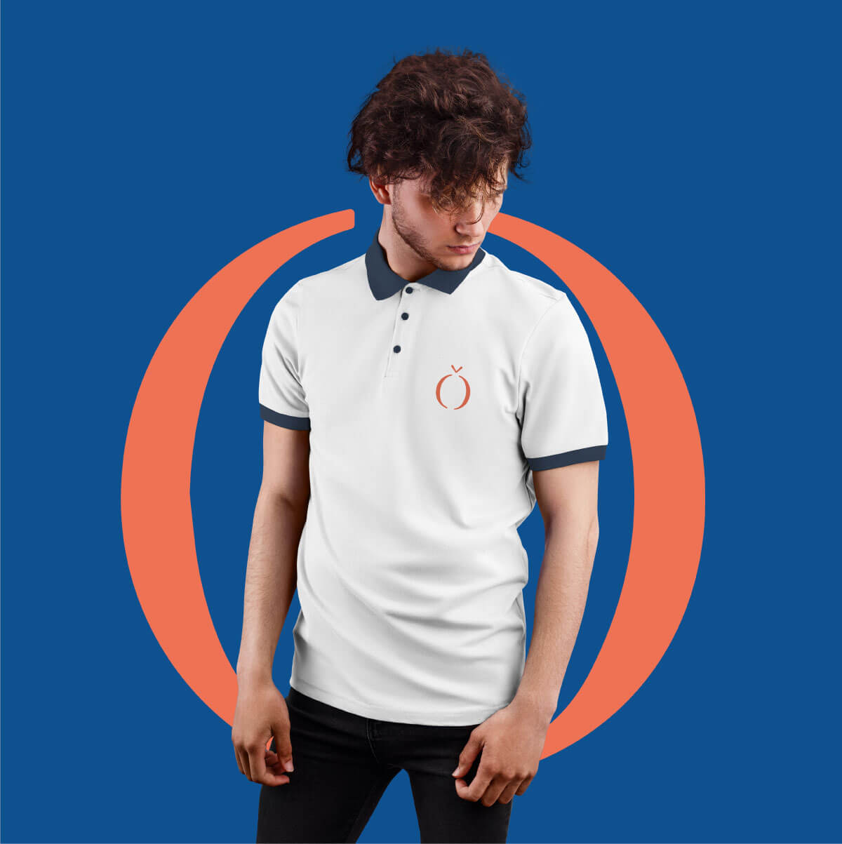
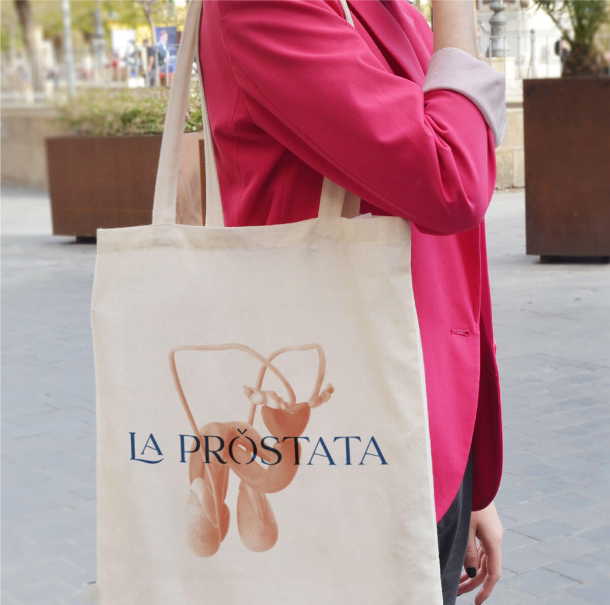
To turn something almost invisible (the prostate) into something very, very visible. To build on the idea that by making men more aware of the existence of the prostate, they will become more aware of the existence of prostate cancer as a consequence.
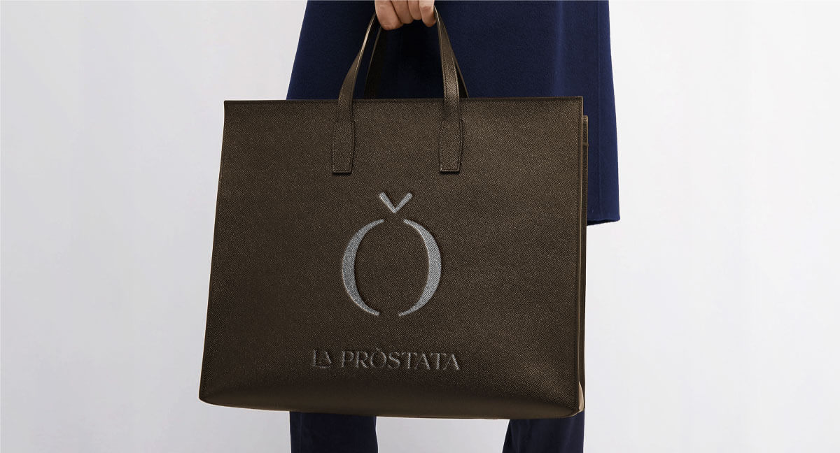
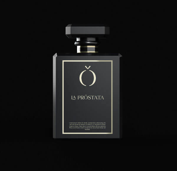
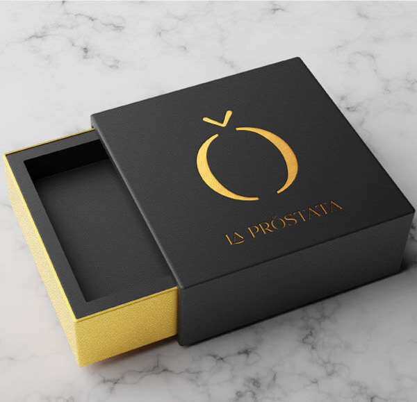
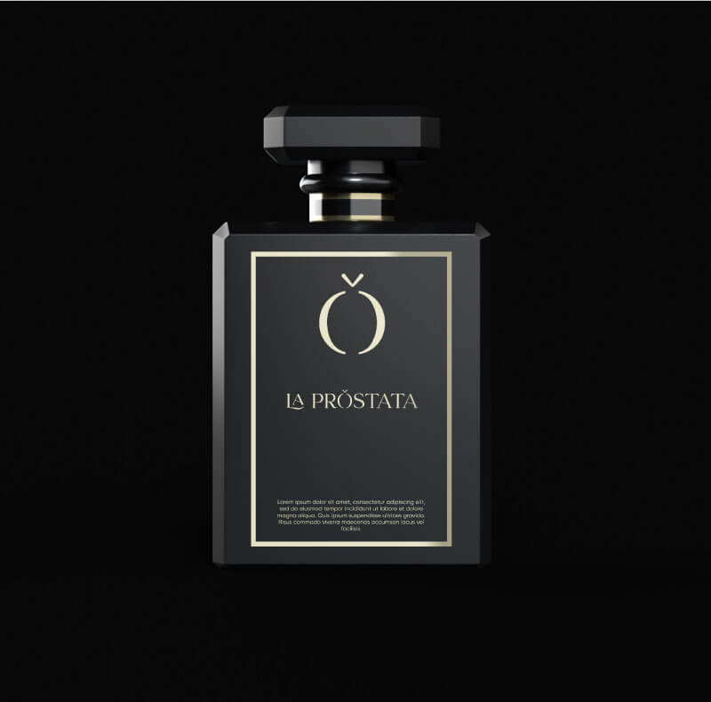
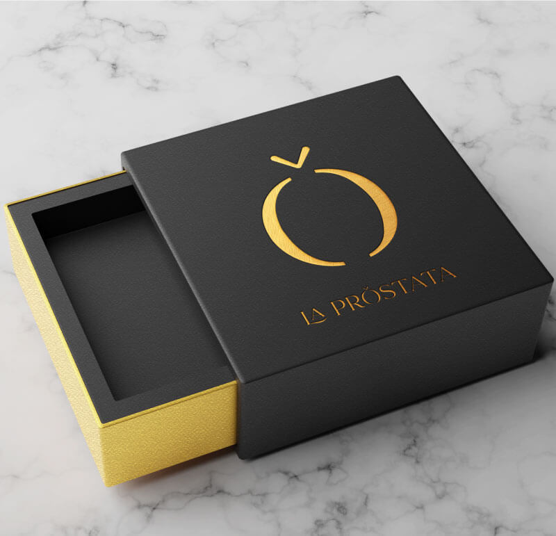
Our proposal? To make the prostate the first organ with its own branding project created by professionals. With a recognizable logo. And shareable.
To convert something that, in reality, is almost abstract for men and to give it an attractive, univocal and shareable image, establishing a solid and recognizable base from which awareness for the cause will grow and evolve from now on.
Con el patrocinio de:

Con el auspicio de:

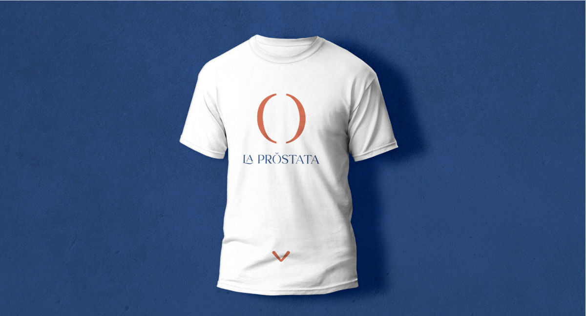
Retocamos “LA” para hacer un elemento más identificativo y personal. A su vez generamos dinamismo con la letra “L”.

La letra “o” nos recuerda a la próstata. Por lo que hacemos una interpretación sintética de la próstata.

Una de las premisas de la campaña es visualizar la próstata. Para ello utilizamos un acento en forma de flecha que nos ubica la próstata.

Al igual que el rosa está asociado al cáncer de mama, en algunos lugares se utiliza el azul para el cáncer de próstata. Por ello elegimos un tono azul marino, que nos aporta seriedad a la iniciativa y un toque más masculino.
Se utilizará el tono rojo, más cálido, para generar contraste con el color frío del azul.
Y un tono beige que complemente ambos colores y que enrriquezca la gama cromática de las piezas.