Branding
BRIEF
By their very nature, business projects tend to grow. To evolve. It is the only way to stay relevant, profitable and operational. In the case of Port Hotels, this desire for growth and improvement has always been linked to its ability to detect the new needs of its clients, the sector, the province and the company itself.
IDEA
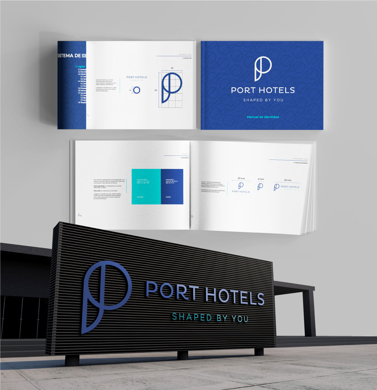
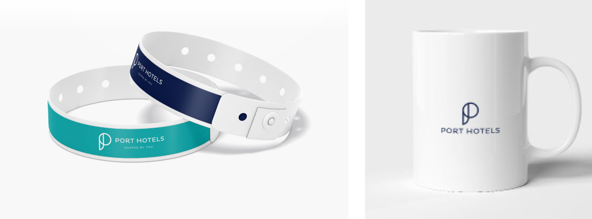
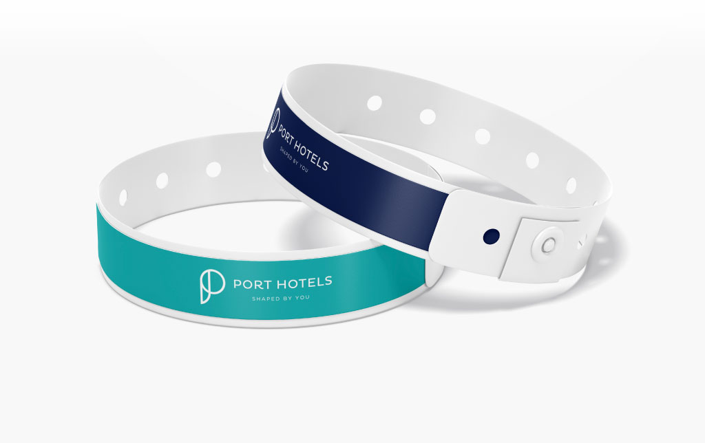
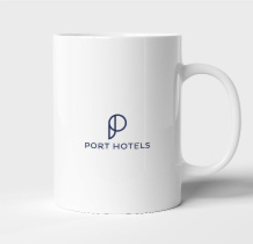
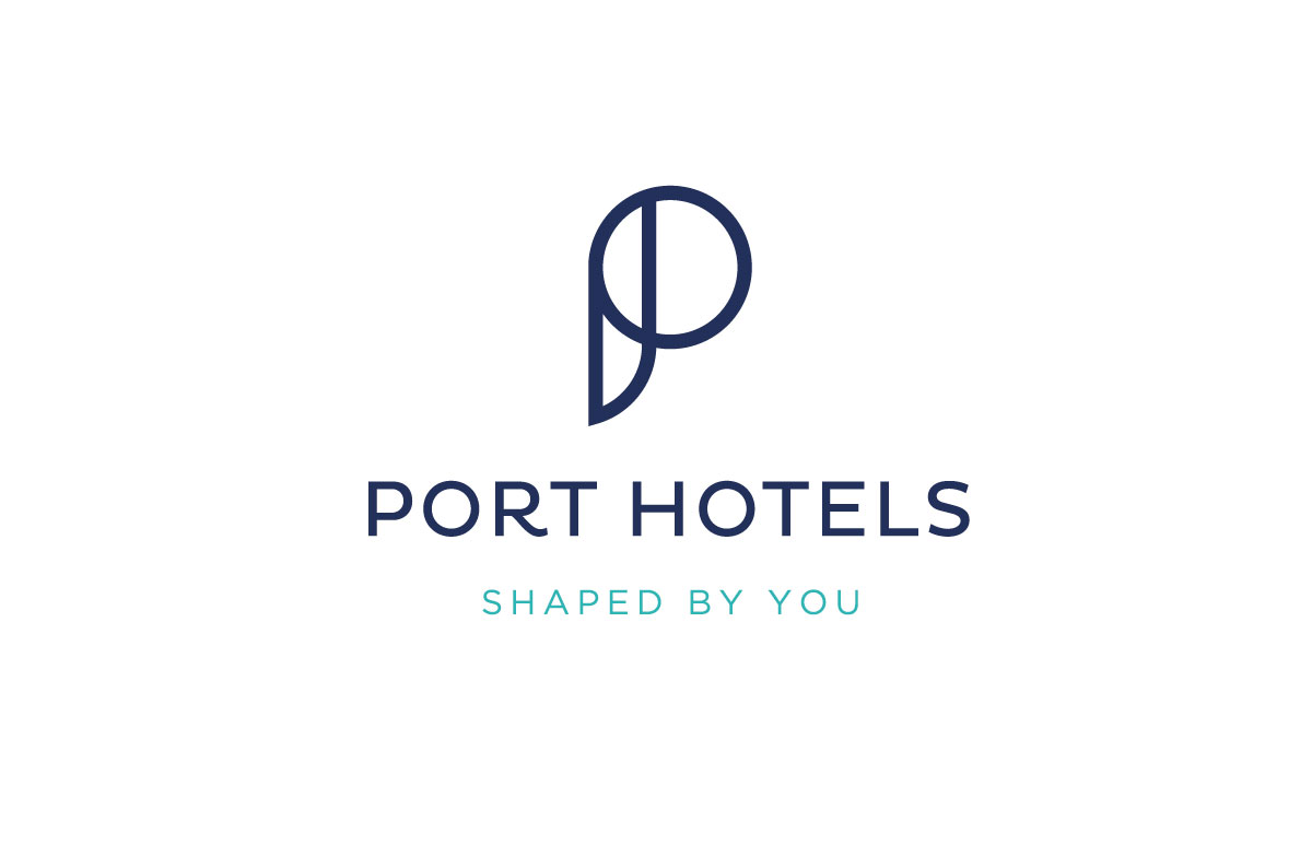
This strategic expansion of Port Hotels’ business focuses clearly involves a repositioning of the brand, for which the development of a new identity that reflects in a faithful, coherent and relevant way both what Port Hotels is today and what it intends to be in future phases of growth and expansion was considered key.
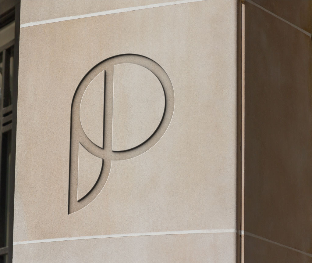
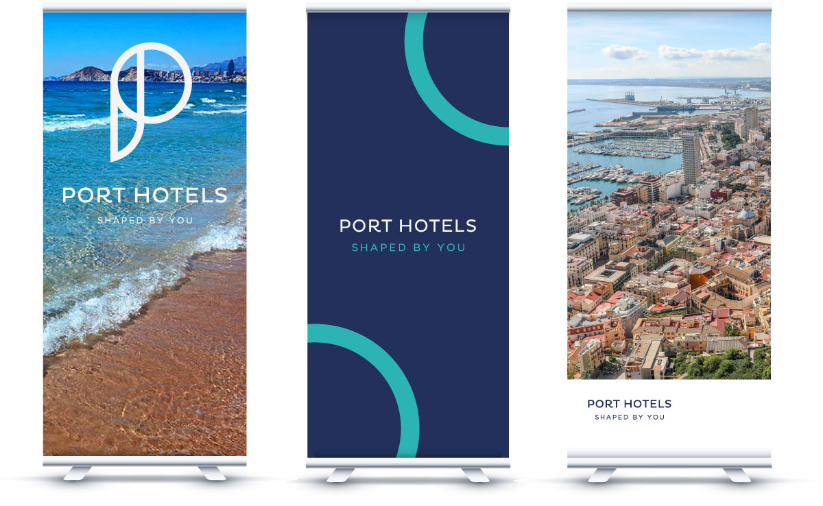
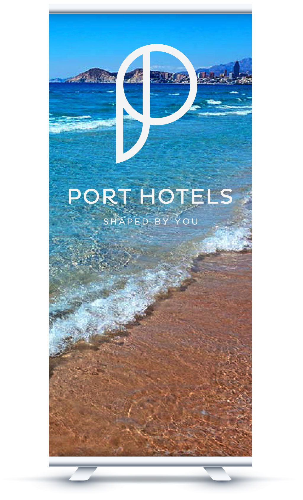
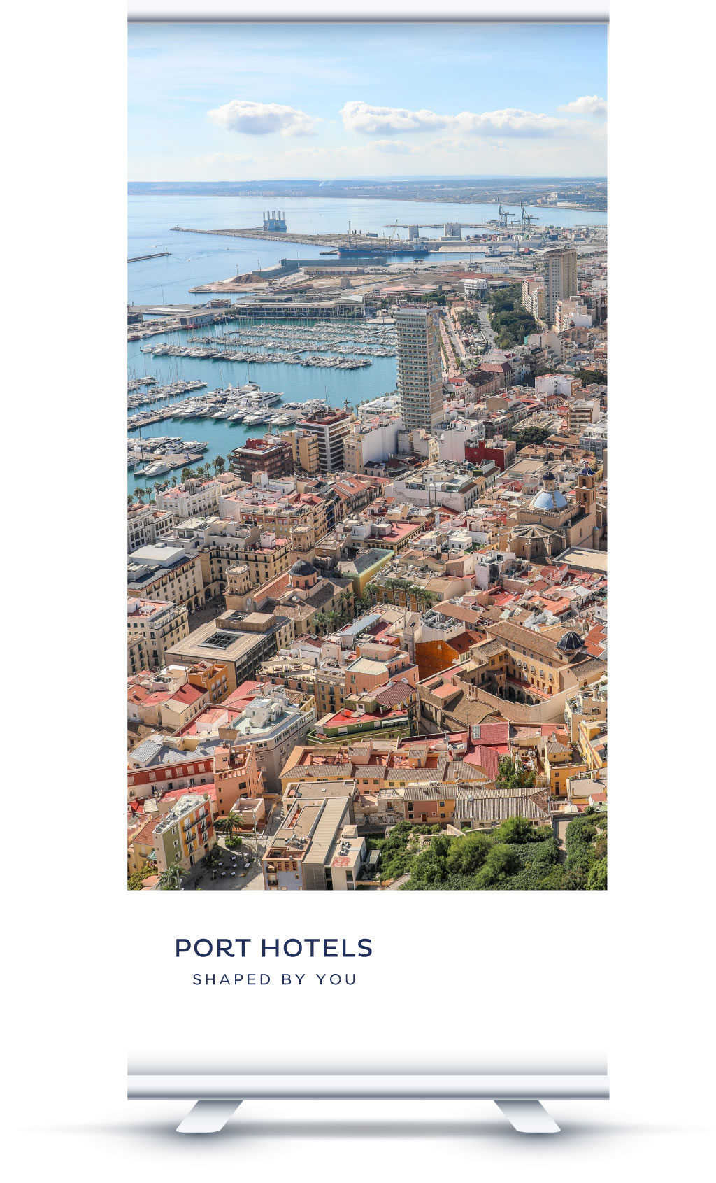
This update of the Port Hotels brand was not a simple aesthetic update. But a philosophical reinvention that was inspired by its essence to communicate all the new features that Port Hotels proposes in this new stage and make them evident in each of the points of contact with its customers. An essence that was found in its ability to adapt and adjust to its customers, the sector and the environment itself.
Antes:
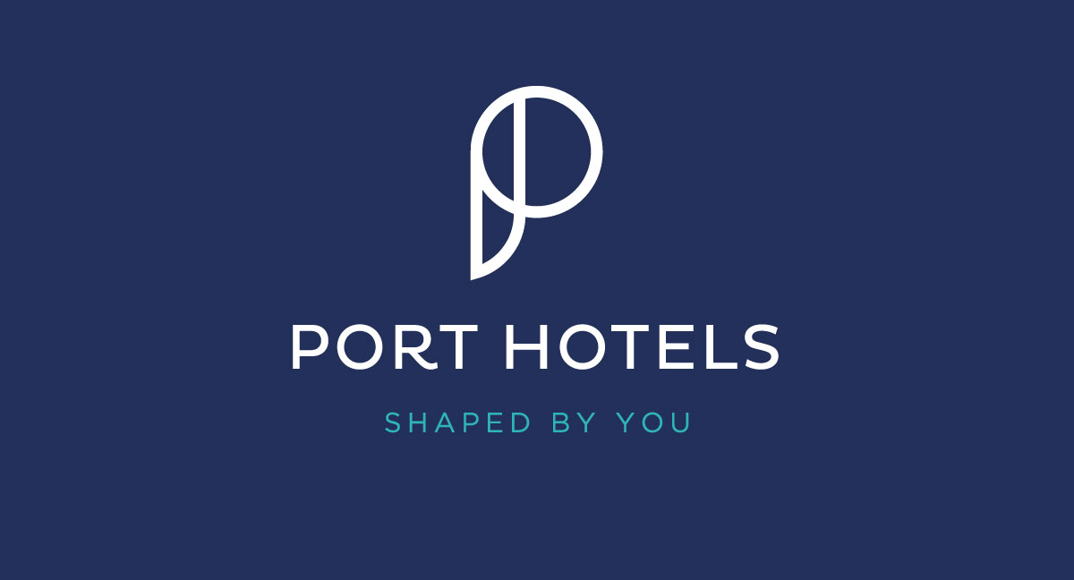
Después:
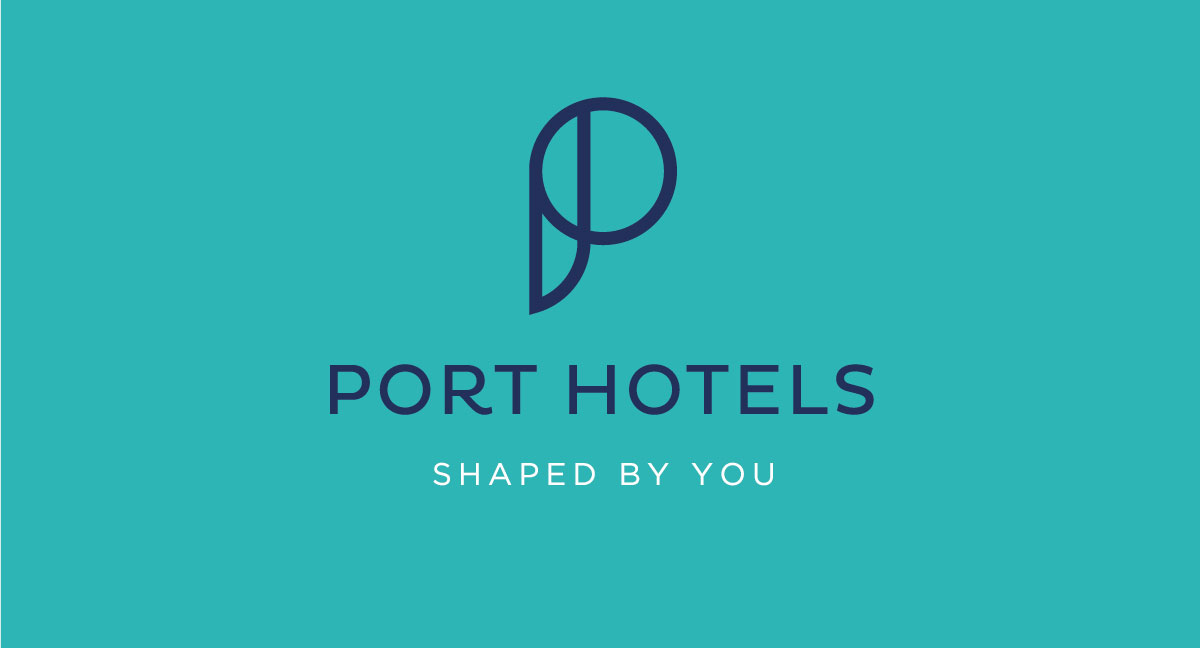
PANTONE 534 C
CMYK: 100 / 89 / 36 / 24
RGB: 34 / 47 / 91
PANTONE: 3252 C
CMYK: 71/ 0 / 33 / 0
RGB: 44 / 182 / 184