Branding
BRIEF
The Municipal Board of Tourism and Beaches of Alicante presented us with the need to update the image of its brand “Alicante City & Beach”. A challenge that, far from being limited exclusively to the field of communication and design, had to take into account emotional, commercial, touristic, cultural and technological parameters.
In this sense, Alicante needed a brand that represented its spirit, but also an identifier capable of awakening sensations in tourists and visitors, making them the protagonist of an experience in which they feel part of a welcoming, rich and diverse city.
IDEA
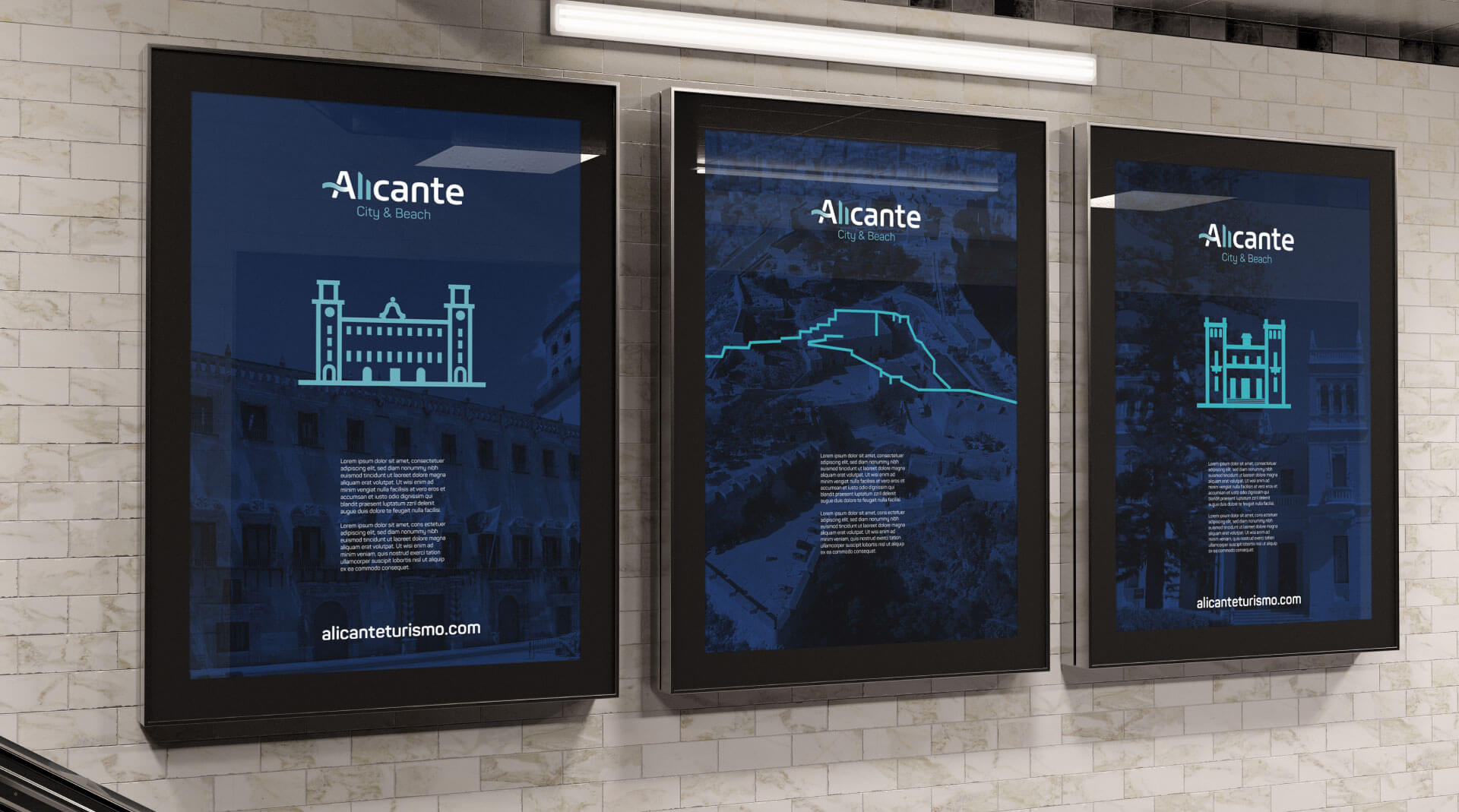
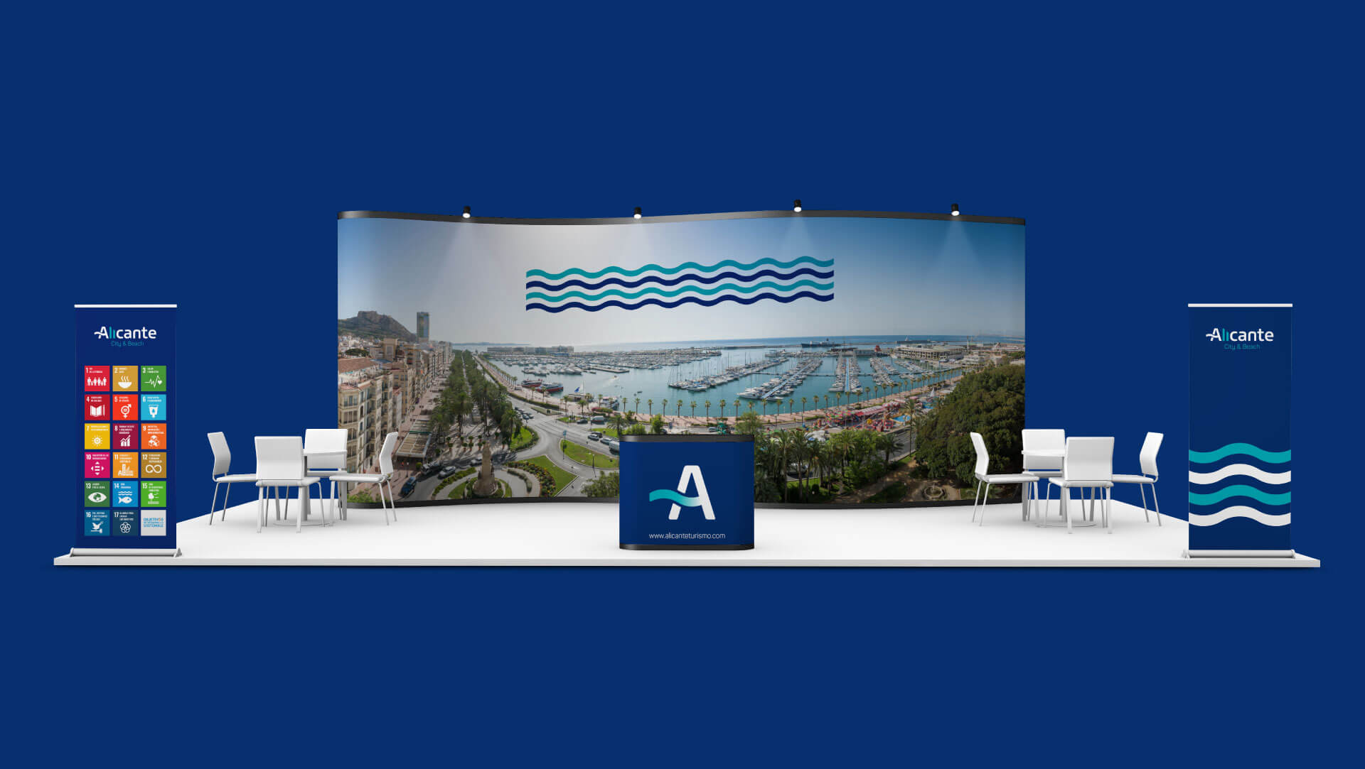
The tourist offer provided by a destination of the category of Alicante did not need a simple logo: it required a comprehensive identity and prepared to live naturally in the new digital communication channels. A more adaptable and versatile identifier that allows us to make the Alicante brand shine in a wide range of areas.
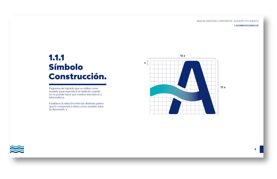
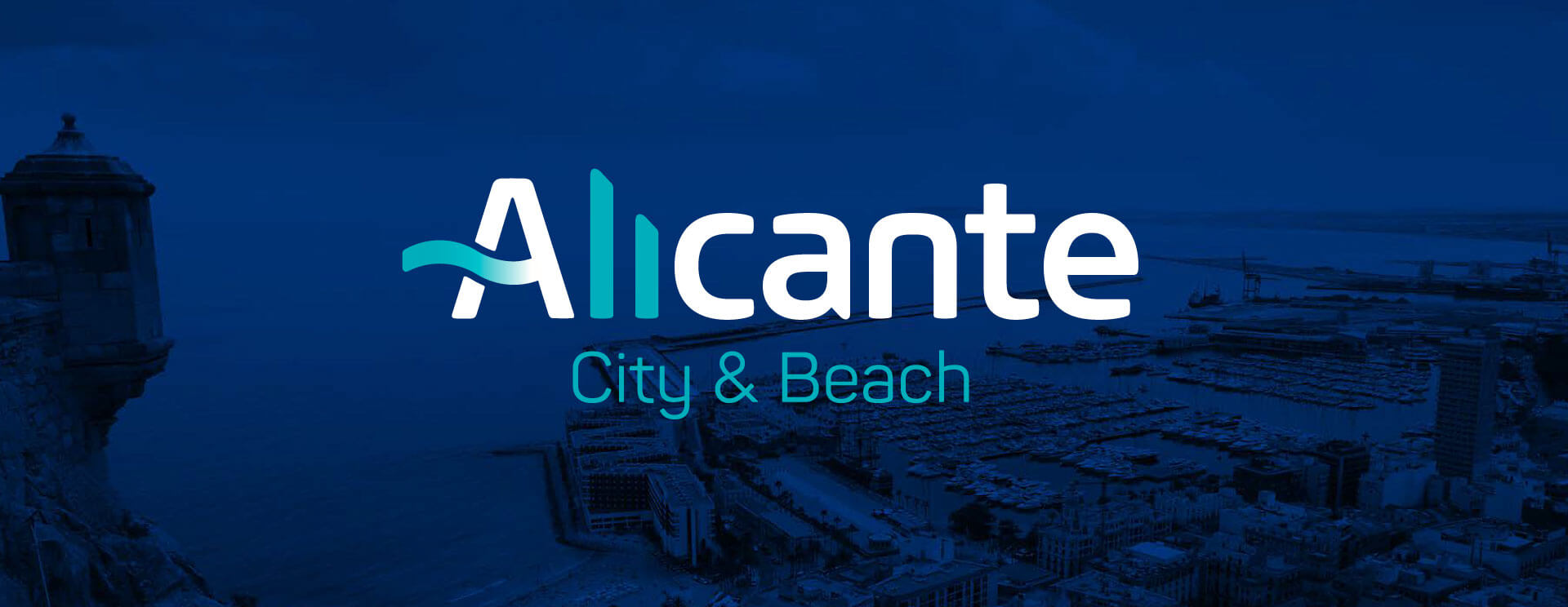
Thus, we decided to give more prominence to the name of the city itself, integrating the capital “A” and the symbol of the wave. Joining these two elements that were already present, separately, in the previous version, we achieved a much more synthetic, independent and identifying symbol of the destination.
But the evolution of the Alicante City & Beach brand is not only able to talk about the city: it is also able to talk about its visitors, putting them at the centre, transforming itself to adapt to both their segment and their interests.
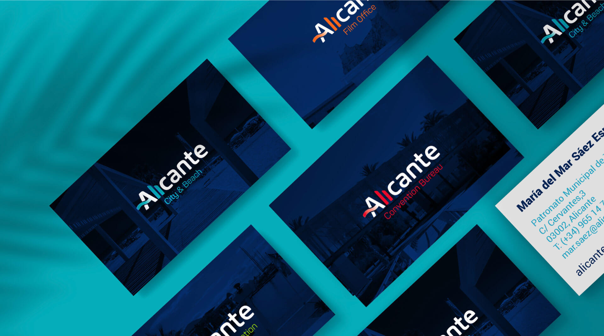
This ability to enhance the visibility of the features and tourism products offered by the destination is especially evident in what was the old Skyline of the brand, now converted into a dynamic showcase capable of showing us everything that Alicante is: gastronomy, culture, Mediterranean, technology, sport, sustainability, proximity, business development, digital, etc..


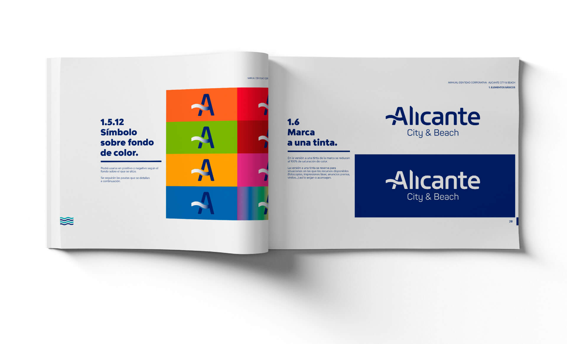
Terminales redondos, actuales, cercanos y amigables.

Eliminamos el remate de la letra “L” y el punto de la letra “i” para crear de nuevo el skyline de la ciudad.

Ajustamos el interletrado a un retícula. Ahora está más junto.

Aplicando las mismas características del remate de la letra “a” para construir un skyline personal e identificactivo.

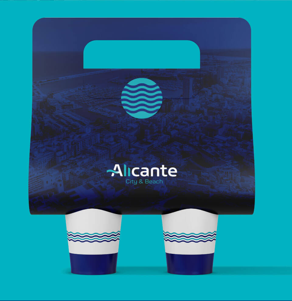
Colocamos la ola (beach) como parte del la letra “a”. Una letra genuina e impactante.


PANTONE 294C
Un azul marino más similar al color de la bandera de Alicante (más nuestro) y que contrasta perfectamente con el azul turquesa.
PANTONE 7466C
Se apuesta por la utilización de colores más digitales, enérgicos y luminosos. Tanto para la marca madre como para cada una de las submarcas.